10+ Lineage Spreadsheets Replaced with Databricks-Power BI
How we went from 10+ manually-synced Excel sheets to an automated, end-to-end data lineage explorer across Databricks and Power BI?
There is a question that haunts every data team at some point in a large migration project. You are on a call, a senior stakeholder points at a number on a dashboard, and asks:
“Why did this change?” You nod confidently. Although you have no idea.
It started with an instinct: if a task is repetitive, fragile, and business-critical, it probably should not live in a spreadsheet. Or, put less formally, sometimes the time-saving solution is the right engineering solution. This is the story of how we built our way out of an unpleasant situation – using Databricks AI, Microsoft Fabric, and Power BI – on a real enterprise ERP migration project.
The Problem: Lots of SQL views, many Power BI reports, and one very honest question
The project context: an enterprise ERP migration, moving from a legacy system to a modern platform. On paper, the scope is a reporting modernisation. In practice, it is a sprawling dependency graph involving multiple teams, two data platforms, and code at a scale that is hard to appreciate until you try to change something.
14+ Power BI Reports
136 SQL Views
200K Lines of Code
These are the questions that make data lineage practical rather than theoretical.
When you are maintaining code at this scale across multiple teams, the first question that surfaces is not “how do we migrate?” It is “how do we even know what depends on what?” Which view feeds which report? If we change this SQL logic, which dashboards break? Which measures in Power BI are actually used, and which ones have been dead for two years but nobody dared to delete them?
These are not edge-case questions. They come up in every sprint planning, every impact analysis, every “quick change” that turns into a three-day investigation.
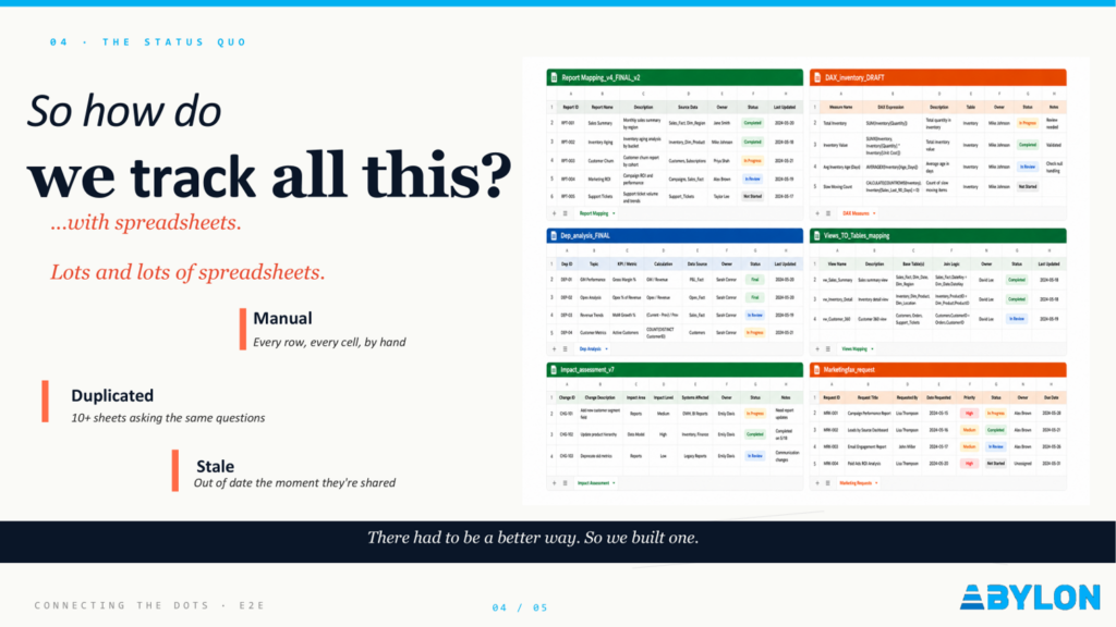
The Status Quo - The Spreadsheet Era, and Why It Stopped Scaling
Before the automated solution existed, the answer to “what depends on what?” lived in a lot of spreadsheets. Each team had their own data lineage sheet. Each had a slightly different structure. Each was accurate as of a date that was always sometime last month.
The three risks of manual lineage tracking:
- It is manual. Every row entered by hand. Every change requiring someone to remember to update the file. Nobody remembers to update the file.
- It is duplicated. Ten-plus sheets, all asking the same question, all giving slightly different answers. Reconciling them is a project in itself.
- It is stale. A spreadsheet is usually accurate only until the next change. By the time someone reads it, it may already be out of date.
To be fair, the people maintaining these sheets were doing their best with the tools available. The problem was the absence of a better tool. And the gap was a specific one: Databricks has built-in lineage at the system level. Power BI, at least when reports are saved in the standard format, gives you almost nothing programmatically. Between the two platforms? Complete blindspot.
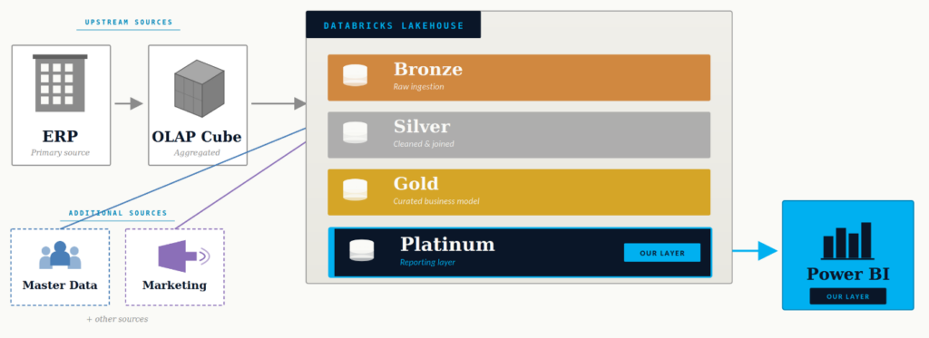
The Architecture – Where Do We Fit In the Customer’s Stack?
The customer’s data architecture follows the standard medallion pattern, with data flowing from the ERP source through an OLAP layer into Databricks.
- Bronze for raw ingestion,
- Silver for cleaning and joins,
- Gold for the curated business model.
- On top of that sits a Platinum layer which acts as a reporting-optimised view of the data, before it flows into Power BI dashboards.
Our team’s responsibility covers the two layers closing the architecture, till end-user consumption: Platinum and Power BI. Which is also, conveniently, exactly where the lineage problem is most acute. The gap between what Databricks knows about its own objects and what Power BI knows about its own reports is where metadata goes to die.
The Insight
Do you know that Databricks system tables are a goldmine, but most people walk past them?
Here is the thing about Databricks that most people do not fully appreciate until they need it: the platform stores a rich set of metadata about everything it manages tables, views, columns, dependencies, lineage events in system.information_schema and related system tables. This metadata is queryable, structured and it’s always current.
The question was: could we use that metadata, combined with an AI agent, to reconstruct the full dependency graph of our SQL views and then connect it to what Power BI was doing on the other side?
The answer turned out to be yes. But with a catch on the Power BI side.
Power BI reports saved in the standard .pbix format are essentially binary blobs. You can open them in the desktop app. You cannot easily query their internals programmatically without installing additional tooling. But Power BI reports saved as .pbip - the Project format – are a different story. PBIP decomposes the report into human-readable (and machine-readable) JSON and metadata files. Tables, measures, relationships, report structure: all of it is exposed in the file system, ready to be parsed by anyone – or anything – with a notebook and a bit of Python.
That is why PBIP became the key requirement: using PBIP files for Power BI report analysis gave us access to measures, tables, relationships, and report structure.
This became the foundational architectural decision for the whole solution: reports must be saved as PBIP.
The Solution - The Time-Saving Solution Which Turned Out To Be The Smart Way
The solution we built has four components. Not a single one of them involves manually entering anything into a spreadsheet.
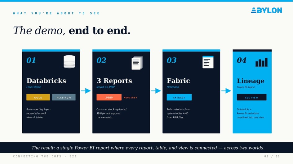
- Databricks (Gold + Platinum layers)
Both reporting layers are recreated as real tables and views in Databricks, including in a free-tier environment for demo purposes. This is the data side: the source of truth for what the business logic actually computes.
- Three Power BI reports, saved as PBIP
We replicated a representative slice of the customer’s reporting stack as three Power BI reports, each saved in the PBIP project format. This is the key prerequisite: without PBIP, the metadata extraction does not work. With it, you get full structural access to every measure, table, and relationship in the report.
- A Fabric notebook that extracts and combines metadata
The Fabric notebook is where the two worlds meet. It queries Databricks system tables for view and table dependencies, parses the PBIP file structure for Power BI metadata, and combines both into a unified dataset. The result is a single repeatable process that stays current without manual spreadsheet updates.
- A lineage Power BI report: the end result
The final output is itself a Power BI report: an interactive lineage explorer where you can trace any Power BI measure back through the DAX logic, through the Power BI data model, through the Platinum SQL view, all the way to the Gold layer in Databricks. Filter by report, by table, by view. Click through the dependency chain. Answer the question “why did this number change?” in under a minute.
Key Takeaways
- What we would tell our past selves
A few things became clear during this project that are worth sharing explicitly, because they would have saved us time if someone had said them out loud earlier.
- Good metadata is infrastructure
The reason this solution works is because Databricks treats its own system tables as a first-class part of the platform. The metadata is there, it is accurate, and it is queryable. The lesson: when you invest in maintaining clean metadata – proper naming, consistent tagging, structured view definitions – you are building fuel for every automation, every AI agent, and every audit that comes after.
- PBIP is not optional if you want automation
The PBIP format is still relatively new and not universally adopted. Most teams that have been using Power BI for years have a library of .pbix files. Migrating them to PBIP is a low-effort but high-impact step and any new report should default to PBIP from day one. If you cannot query your reports programmatically, you cannot automate anything about them.
- Agentic AI is genuinely useful for dependency analysis
We used Databricks AI in agentic mode to help construct the dependency-tracing logic, essentially asking it to query the system tables, follow the dependency chain iteratively, and output clean structured results. The experience was legitimately impressive for this type of task. Recursive SQL dependency tracing is exactly the kind of problem where an agent that can run queries, inspect results, and refine its approach outperforms a human writing a static query. It is not magic. It is just a very good tool used for a task it is well-suited to.
- The lineage gap is not a Databricks problem or a Power BI problem
It is a between-platforms problem, and it only exists because nobody has an incentive to solve it at the vendor level. Databricks does not know what Power BI is doing with its data. Power BI does not know what Databricks has computed. The only way to close this gap is at the integration layer, which is exactly what a Fabric notebook, positioned between the two, is well-placed to do.
One Honest Recommendation
If you are working on a data project where more than one person has ever asked “wait, what does this report actually show?” – you probably have a lineage problem. It might be small today, but it usually grows with every new report, view, and team involved.
The tools to solve it exist. Databricks system tables, Fabric notebooks, Power BI in PBIP format: none of these require enterprise licences or months of platform engineering. The demo environment we built for this talk runs entirely on free tier. The only real prerequisite is a willingness to treat metadata as something worth investing in, plus the right kind of laziness. The kind that refuses to maintain fragile spreadsheets by hand when the platforms already know most of the answer.
Good metadata is the fuel for everything that comes next.

Author of the post:
Edina Vedelek - Senior Data Analyst at Abylon Consulting. Linkedin Profile

Author of the post:
Oliver Vetesi - Account Delivery Management Lead at Abylon Consulting. Linkedin Profile