In the world of Power BI, there are no identical solutions. Both, the business requirements and the data are almost always different. In the ETL processes as well as in data modeling, we need to find the solutions that can provide the answers to the questions in the simplest and fastest way.
The complexity of the data processing, the running time, the transparency of the tabular model, the complexity of the measures used and the running time are also very important metrics measuring the quality of our work.
When visualizing railway data on a map, the appropriate model can be identified knowing the business meaning of the data and its volume and complexity. Typically, there are two types of data available in case of line-based infrastructures:
- Point
- Route (Railway route
Connecting the fact data with the map objects
Point data can be an extraordinary event (eg accident), data related to an infrastructure element (maximum speed, condition, scheduled maintenance, cost) or detailed traffic data for a certain train based on its railml schedule and actual traffic data. This data can be fitted to a star schema, and the dimension table serving the map can be linked to the model with a simple One to Many connection
In the image below, the EU_OBJECTS dimension table is the display source of the map, it will display the objects (line or point) broken down by ID, based on their type. The EU_TRANSPORT table contains the factual data:
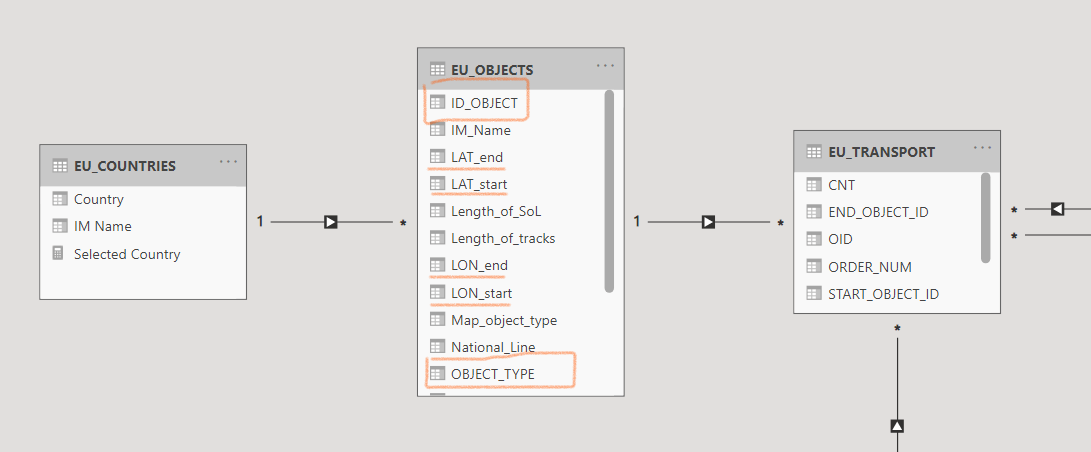
Note: Abylon MAP requires the usage of a unique ID and and object type, so it can be mapped to geojson files, or individual lines can be displayed separately by direction. Click on the button below for more details.
Organizing routing or interval type data into a model
Traffic data that contains a measured value along its entire route is called reference data. Tihis includes passenger traffic, ticket sales data, travel from A to B, or train data that do not change from the start point to the end (eg weight, railway company), but do not include traffic time data or values calculated from them.
We have several choices regarding this data. The problem is similar to period-type data, and there are three available options:
Interval data is broken down into the smallest point-like data required:
Like from time interval to days, and then from relations to line segments and stations. The days of the time interval can be extracted into separate rows in the fact table and these (as points) can be added into the data model.
Tabular On the fly:
We entrust the data model to sort out the data using one or two connection tables. See later.
DAX on-the fly:
When working with small amounts of data, instead of complicated modeling or significant data multiplication, we can filter using a DAX filter, in which case the dimension and fact tables are not linked within the model. Continuing with the time interval example: calculate ([something],filter(’Fact’,[datfrom]<=max(’date’[date]) && [datto]>=min(’date’[date]))
Combining solutions 1 and 2 to find a calculation optimum.
In this case the fact data rows are not broken down to an elementary point / section level, but to a higher level (e.g. railway line) and the model itself remains in accordance with number 2. (author’s note: in my opinion, this is the best method, we can provide detailed, pin-level data with it, but more frequent queries tailored to business needs can occur faster).
We will now discuss solution number 2 in more detail.
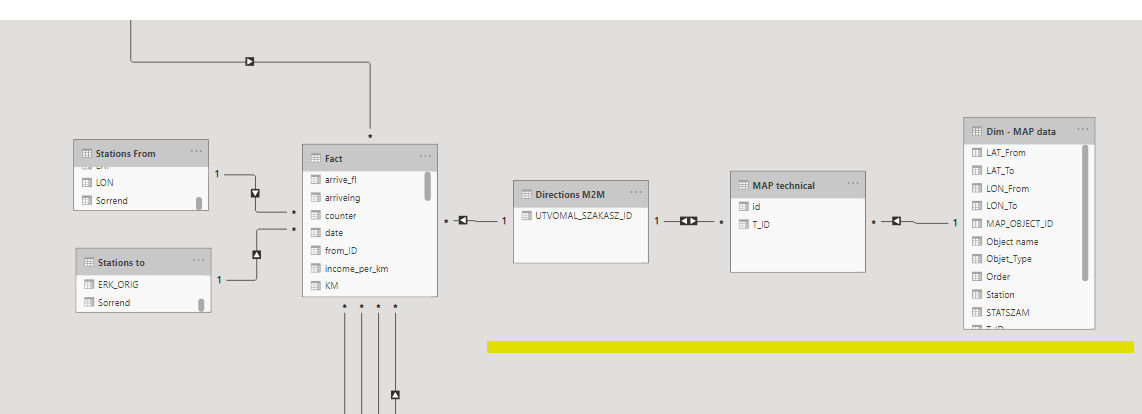
Tables underlined in yellow color provide the dimensional expansion:
The row of the fact table contains data for complete routes, to which is attached the routes M2M table, which contains the unique values of the route identifiers.
Routes are connected with a many-to-many relationships to the MAP object level, whose final dimension table contains the map data: coordinates, names, and so on.
The Fact data is like this:
|
ID |
FROM |
TO |
DIRECTION_ID |
|
123 |
A |
D |
23 |
|
124 |
K |
O |
24 |
The directions M2M connection:
|
DIRECTION_ID |
|
23 |
|
24 |
The MAP technical table is for extracting the directions:
|
DIRECTION_ID |
MAP_OBJECT_ID |
|
123 |
A |
|
123 |
B |
|
123 |
C |
|
123 |
D |
|
124 |
|
|
124 |
|
|
124 |
|
This approach allows you to assign data to an elementary map object without multiplying rows.
So, if we filter for an individual object in the MAP’s dimension (e.g an elementary section of line), the engine will calculate all of directions that have this element in the route description, and the fact data will be filtered for them
Which approach is the best?
In the case of point data, the question seems clear, although we have already seen a case where a set of factual data was related to a railway station and also to the related section. With railway data models, it is particularly interesting that you need to handle the relation to a railway line itself, so the master data of the map should contain the stations that belong to several lines multiple times.
In terms of where to start with relative/related data, the quantity and quality of the data is the decisive factor. With that knowledge (and clear business requirements) an experienced data modeler can easily chose the right approach.
If we set aside the railroad example and look for a more straightforward example, successful management of the time interval may still be the right example
|
Business Case |
Solution |
|
Short time intervals (1-3 days) |
It is recommended to transform the time interval to a point regardless of the amount of data, as it does not cause an increase in the size of the rows of factual data. |
|
Long time intervals with limited data (such as contract records) |
In this case, the model-based on-the-fly and the daily breakdown would result in unnecessary duplication of rows, but the the dax on-the-fly approach is a good choice and we can treat the factual data with interval-filtered measures based on an independent date table. |
|
Medium / variable time intervals, large amount of data (hotel reservations) |
If our calculations show that breaking down the data into days would increase the number of rows by an order of magnitude (minimum 5-10 day average time interval), it is recommend to use the model-level on-the-fly approach. |
|
Medium / variable time intervals, with extremely large amount of data or special requirements |
In some cases, it is necessary to try to keep the size of the tables implementing M2M connections manageable. In this case it may be worth combining the different solutions:
In this case, there will be 28 rows for a week, which can provide a favorable breakdown even for a multi-year interval. |
Custom Power BI map visualizations for railway companies
Abylon MAP is built on top of Power BI offering, custom, advanced map visualization features for companies dealing with line-based infrastructures. It is ideal for railway (or other transportation companies dealing with line-based infrastructures) looking for an affordable, customizable, easy-to-use map visualization tool for Power BI.
- Infrastructure-specific Power BI map visualizations
- Visualization of line-based networks using both circles and lines
- Full integration with Power BI (built on top of it)
- Active maps based on Power BI models or GeoJSO