Avoiding the Trap: Designing a Purposeful Power BI Sales Report
Dear Reader,
You’ve probably seen countless dashboards and scrolled past a ton of LinkedIn posts raving about shiny new features in Power BI, Tableau, or whatever tool your company swears by.
But today, I want to share a story about a win I achieved—a win that didn’t rely on flashy features or cutting-edge tech. It’s a tale of how I impressed a country-level CEO of a multinational company without ever meeting or speaking with him directly. Hopefully, by the end, both you and I will take away something valuable.
So, let’s talk about a trap…
The Trap of Report Design
If you’ve ever built a report or dashboard (say, in Power BI), you may have fallen into this trap:
- Believing that a shiny, visually impressive report equals a good report.
- Thinking that creating dozens of dashboards exploring the same data from every angle will make the client happy.
Sometimes, this approach works—especially if you have no specification, or clue who your audience is or what they really care about.
But let me be clear: I’m not here to play the Power BI guru.
I mean, I think I know my way around Power BI, I have experience with data modeling, DAX, etc… But I’ve seen my colleagues create some next-level stuff with these tools. They are probably much better at utilizing all the technical features of Power BI and yet, even they occasionally get caught up in exploratory analysis or crafting intricate dashboards that overlook one critical factor: the client.
The Project
Let me set the stage:
I was handed a project by my boss, who had gathered a brief specification from the client—a regional CEO of a multinational company.
The spec? Short and specific:
- The business has shops across a specific country.
- The CEO wants to compare a given day’s revenue with the same day’s revenue from the previous year, per shop.
That’s it.
The pressure was on—we wanted to make an impression.
This seemed like a typical one-fact-table-story. Data was gathered from the source systems, and we had everything we needed for a classic star schema setup. It would’ve been easy to churn out dashboards comparing year-over-year totals with standard DAX measures: bar charts, line charts, totals by shop—you name it.
But I decided to take a different approach.
My approach
I started by asking myself a few key questions:
- What’s the narrative behind this request?
- What action is the CEO hoping to take based on this report?
- What does “last year’s same day” actually mean in this context?
- If I were the CEO, what would I want to see?
From there, I built a narrative—a train of thought I could present confidently, even without ever meeting the CEO.
Here’s where it got interesting:
After pushing a little harder I got a hint from my boss that the CEO wanted to use the report to identify shops with underperforming predicted daily revenue (compared to the same day last year) and call their managers to address the issue.
This insight gave me a story to work with.
The Narrative / Story
- Daily Usage
For a Power BI sales report like this, frequent refreshes were essential, given its daily use.
- Daily Revenue Focus
Comparing total yearly revenue wasn’t relevant—it was all about today vs. the same day last year.
- Same week and same day approach
This led me to a risky decision: I chose to compare the current day’s revenue with the same weekday from the previous year (e.g., this year’s Tuesday to last year’s Tuesday). This required extra effort on the data model but made more sense contextually.
Also, for the comparison I chose to limit the revenue from last year’s same week’s same day up until the refresh point of “today”. So, if I had a refresh time for today at 10:30 AM, I also took last year’s same week’s same day’s revenues UNTIL 10:30 AM that day, so that the data is comparable.
- Actionable Visualizations
After that, I started to play along with the data and the visualizations and started with the question: “What would I want to see, if I was the CEO?”
I designed the dashboard to highlight the “good” and “bad” shops at a glance. This way, the CEO could immediately see where to focus attention.
Further questions
As I worked on the dashboard and fortunately some production data started flowing through the report, more “Okay, but…” questions emerged:
- If a shop’s revenue looks bad today, how’s it performing annually?
- Are there specific product categories driving the decline?
- How are those categories doing overall year-on-year?
- Is the entire region or country outperforming last year’s same day?
These questions added depth and direction to the report, ensuring it didn’t just present data but told a story.
Technical decisions
- Prioritize reliability over flashy features—no CEO wants to make calls about a broken report.
- Use Microsoft Fabric, which made API calls and frequent refreshes (every 30 minutes!) straightforward.
Preparing for the Demo
The demo was brief but successful, thanks to thorough preparation:
- I scripted a narrative for the presentation. While I didn’t read it verbatim, it helped structure my thoughts.
- I tracked data for days beforehand to ensure accuracy.
- I stress-tested filters, drill-downs, and DAX measures to avoid hiccups.
The whole demo took us only about 10-15 minutes altogether, skipping any part that is not straight to the point, and that doesn’t add to the report’s value.
The CEO’s response? “I like it, thank you.”
Why It Worked
This wasn’t just about avoiding unnecessary dashboards. It was about creating a focused, actionable report tailored to the client’s specific needs.
The narrative engaged the CEO, and the report delivered immediate value. Plus, the feedback gathered during the demo allowed us to refine the report further—ensuring a polished final product.
Conclusion
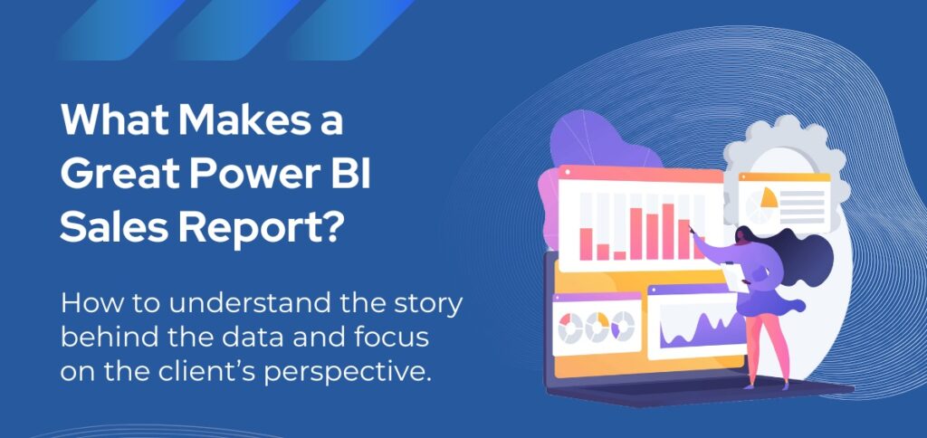
Sometimes, the difference between a good report and a great one lies in understanding the story behind the data. Focus on the client’s perspective, and you might just hear, “I like it, thank you,” too.
Other popular blogposts from the same author:

Author of the post:
Zsolt Kreisz - Financial Controller in the past, now BI Consultant at Abylon Consulting. Linkedin Profile

